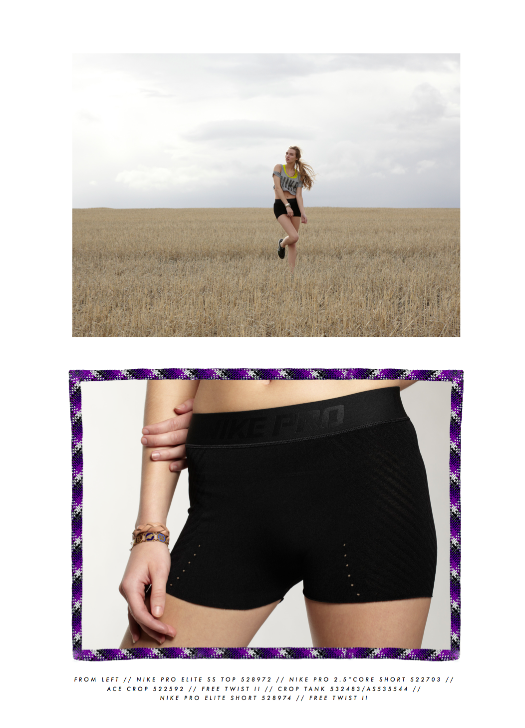


From early 2010 to late 2012 I was the Senior Graphic Designer for Nike Womens Training. My role was to be the sole print and graphic designer for the entire category. My roles were to concept graphic creative direction for the category and to design prints and graphics. However I arrived at the category in a time of major flux in the category and soon I was tasked with becoming the right hand man to the Concept Director. My role drastically changed.

In a team of two: the Concept Director and myself we were tasked with driving concept direction for the entire category and bringing it to life through look books, videos, interior spaces, large runway style presentations for the WHQ. Meanwhile I was also still designing the apparel and footwear graphics for the category.
My role as the untitled Senior Concept Designer was to work with the Concept director, the category designers, design directors and creative director. I would take those concepts and create ways to display them, or present them visually in an engaging and exciting way while keeping the vision of the category consistent and clear.

This is an example of the wide range of projects this role entailed. I designed a larger than life translucent cube to be the centerpiece of a runway show. The cube had seamless video projections on all 4 sides from the inside. I also worked directly with and managed multiple contractors for these builds and large productions.

While concepting, designing, managing and building sets I was also designing the graphics for all of womens training apparel. There were seasons where my hand seemed everywhere: the graphics, the videos, the look books, the sets, the videos and more.

I was also tasked with art directing look books. This meant at times hiring and directing freelance designers and interns. Some other aspects of this role included photography (sometimes mine, sometimes hiring studios, usually both), typography, set design and build, and location scouting.

Entrance way to a large internal presentation. Lighting design, graphics and neon literally set the stage for what is beyond.

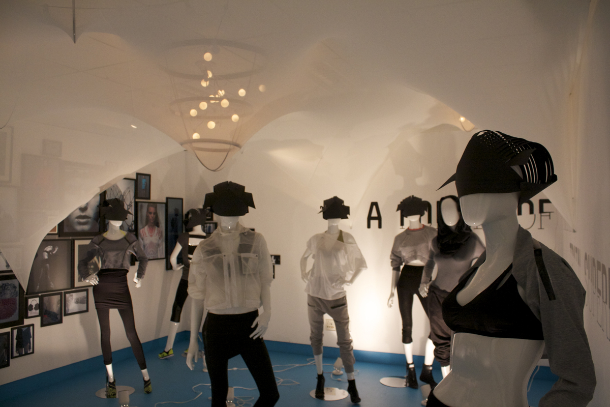
Example of a concept debut rig room.
The concept team started each season with a concept room. This would then be changed and upgraded for each step in the calendar. Ie: Concept, design review, intergrated design review, company wide review in larger spaces and so on. This was a very literal way to show that the concept and designs teams were sticking to the direction set out at the beginning of each season.
This room was a favorite of mine because we took the concept of translucent materials and visible architecture for apparel and footwear design to a new place by stretching fabrics over frames to create a futuristic vaulted ceiling effect. It was "just" a rig room but I loved it's beautiful simplicity.